
Vintage labels: when packaging stays true to itself
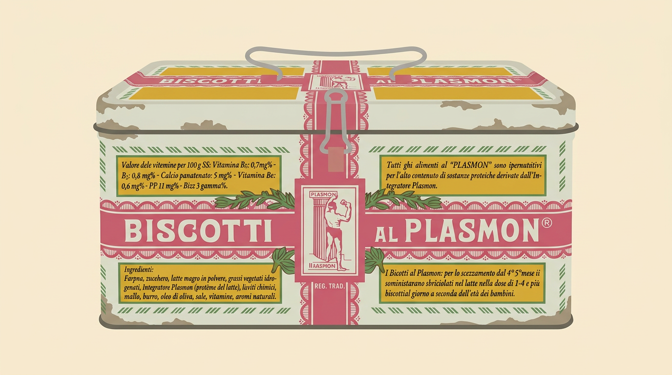
A few days ago, scrolling through photos of an urbex exploration on a social group I follow, a detail stopped me: among rubble and peeling wallpaper, an old box of Plasmon biscuits. Ochre yellow tin, the kind anyone who grew up in Italy recognizes at first glance, even covered in dust inside a house abandoned for decades. Those tones have been paired, since the mid-twentieth century, with the unmistakable fuchsia band carrying the logotype, a chromatic choice that was bold for its era and that time has turned into a signature. And that is exactly the point: we recognize it. There is no need to read the name; the combination of colors and proportions is enough. That box still speaks, and it speaks the same language it spoke a hundred years ago.
The ochre yellow box that crosses a century
Plasmon was born in Milan in 1902, and by the end of the First World War, its yellow and red metal container had become a fixture in Italian pantries. The brand has changed owners, formats, materials, and even advertising eras, from Carosello to social media. Yet the underlying layout has stayed the same: golden base, warm accents, the fuchsia stripe running across generations, the impression of something that existed before us and will continue after. The old tins are collectors’ items today, and finding one in a derelict building feels like stepping into a time machine. Regular readers know I have a soft spot for these temporal short circuits. I wrote about them in my post on Street View and the places of memory.
The other survivors on the shelf
Plasmon is in good company. The Twinings logo, with its golden lion and serif lettering, has been untouched since 1787: the oldest commercial mark still in use, and the boutique on London’s Strand remains where it has always been. Fernet-Branca has flaunted since 1901 Leopoldo Metlicovitz’s eagle gripping the bottle above the globe, an Art Nouveau illustration no rebranding has ever dared to touch. And Baci Perugina, wrapped in silver with blue stars, came from the pencil of Federico Seneca in 1922, inspired by Hayez’s painting, and ever since then, the little scroll with the love note has followed the same scheme.
The parlor pastilles and the blue tin at grandma’s
Staying in Italy, the case I adore is Leone, the Turin confectioner who has been active since 1857. Around 1880, Luigi Leone had a textbook intuition: pastilles, until then sold loose, moved into small metal boxes decorated in Liberty style, tiny enough to slip into a lady’s purse or a gentleman’s pocket. Cardboard containers arrived in the early 1900s as refills, gilded with period ornaments, and that aesthetic still holds up: the recipe is declaredly unaltered, and the colored wrappers used to tell flavors apart date back only to 1999, a surgical retouch on a graphic framework from the late nineteenth century.
Then there is her, the blue tin of Danish butter cookies. Royal Dansk introduced it in 1966, and since then, by the company’s own admission, nothing has changed: same light blue, same white farmhouse, same five shortbreads on display. Its immortality, however, also runs through a domestic betrayal shared by half the planet: you would lift the lid at grandma’s house, hoping for cookies and find needles, spools, and mismatched buttons. The phenomenon is so universal it has become a global meme, with threads from every continent. And it may be the ultimate compliment to a piece of packaging: a container so sturdy and recognizable that it lives a second, thirty-year existence in family drawers, still advertising the brand even when empty.
Careful, though: faithfulness to a layout does not mean standing still. Plasmon’s lettering has been redrawn several times, the Coca-Cola can has gone through dozens of restylings, and Baci has updated hues and finishes. The evolution happens in imperceptible increments, like the aging of a familiar face: details shift, the physiognomy endures. In industry jargon, this is a brand refresh as opposed to a rebranding, and the difference is worth millions.
What the data says about loyalty
This caution rests on solid ground. According to estimates cited from Euromonitor International, packaging can account for up to 40% of a brand’s value, and 72% of American consumers say the pack influences their purchasing decisions. A study published in Heliyon on the dairy sector confirms that a visual identity that remains consistent over time increases perceived authenticity and reliability, two direct drivers of retention. The mechanism is almost trivial to explain and extremely hard to build: we buy in seconds, guided by visual recognition far more than by reading. Every time a company touches that code, it gambles with decades of memory accumulated in customers’ eyes.
The theme intertwines with what I explored in my analysis of the vanished Italian shelf brands: distribution muscle matters, of course, but a sedimented visual identity is a competitive moat that new entrants cannot buy.
When a restyling goes wrong: the white Coca-Cola can
You already know the most quoted case study, and I have covered it myself in the past, so I will pick another one. December 2011: Coca-Cola launches a white holiday can in the United States, featuring a polar bear, for a charity campaign with the WWF to protect the Arctic. Noble intentions, disastrous execution. Customers mistake it for Diet Coke, silvery as well, and some people with blood sugar issues bring home sugar without knowing it. Others swear the taste is different, even though it is identical. After barely a month, the company pulls everything and returns to red, as documented also by Packaging World. The lesson is crystal clear: the color had become part of the product. Touching it, even for charity and for a limited window, broke the visual pact with buyers. I also dealt with redesigns born without any real necessity in my post on Trenitalia and its superfluous restyling, where the damage was functional as well as aesthetic.
The paradox of nostalgia that sells
There is a delicious irony in all this. Urbex, the passion that put that photo in front of me, thrives on abandonment: silent factories, faded signs, objects frozen at the moment someone closed the door. Historic labels travel the opposite road; they survive precisely because someone has protected them with stubbornness. The outcome, curiously, converges: both move us because they keep a channel open to the past. Except that a Plasmon box rediscovered in a crumbling villa is archaeology, while the same box on a supermarket shelf is strategy. When naming and graphics are born well, as I recounted regarding D’Annunzio, the Futurists, and the christening of brands, they can afford to grow old without ever expiring.
Next time you see a package that looks just like the one your grandparents knew, do not think of creative laziness. Think of how many meetings, rebranding proposals, and revolutionary mockups someone had the courage to turn down. And they were right.
Related sources
- Optimizing brand loyalty through user-centric product package design, Heliyon / PMC
- The power of packaging: how graphic design can influence consumer perception, C&I Studios
- La storia: il marchio Plasmon preserva la sua Oasi, Mark Up
- Storia Plasmon dal 1902, official website
- The 25 oldest logos that are still in use today, The Logo Creative
- Fernet-Branca: a brand history, The Spirits Business
- An Italian story since 1922, Baci Perugina
- Pastiglie Leone: una storia di colori, packaging e successo, Packly
- Fess up, grannies, you ate the butter cookies, NPR Code Switch
- Why does everyone’s mum use that same cookie tin for sewing stuff?, Vice
- The new New Coke? Coca-Cola ditches white cans after one month, TIME
- What went wrong with Coke’s 2011 holiday can design, Packaging World
