
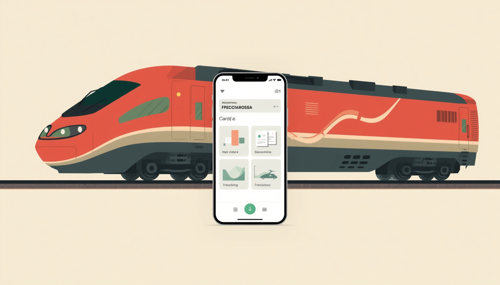
When a redesign makes things worse: the Trenitalia story
I have a train to catch today. The Trenitalia app is showing my ticket. This is worth mentioning because, for the past few months, it often has not been.
A bit of context
Trenitalia is Italy’s main rail operator, the incumbent that built and still dominates the national network. Italo, the private competitor, has carved out roughly 35% of the high-speed market since entering in 2012, which is no small feat. But on regional routes, commuter lines, and slower intercity connections, Trenitalia is basically the only option. That kind of market position is comfortable. Maybe too comfortable.
For years, the Trenitalia app did exactly what it needed to do. Clean layout, logical flow, no unnecessary steps between you and your ticket. From a design perspective, that is actually the goal: get out of the user’s way. Then came the redesign.
What changed, and not for the better
The new app is busier. Scrolling tabs have replaced fixed navigation, which means more visual noise and more finger movement to reach the same destinations. Loading animations, which used to be invisible or at least unobtrusive, are now expressive little graphics, the kind that feel more like a brand exercise than a functional choice. And while the interface looks more “modern,” that word is carrying a lot of weight here, mostly obscuring the fact that things are harder to parse at a glance.
This is not just an aesthetic complaint. There is solid research behind the idea that complexity costs users. According to Smashing Magazine’s work on cognitive overload, unnecessary visual elements increase the mental effort required to complete a task, leading to frustration and, often, abandonment. As I wrote in Attention please, if you will, our capacity to process cluttered interfaces is shrinking, and designers who ignore that are swimming against a strong current. Scrolling tab bars, in particular, are a documented usability risk: when used poorly, they bury key information and turn navigation into a guessing game.
The synchronization problem
The most concrete failure is not about visual design. It is about the app and the website not communicating reliably. If you buy a ticket on trenitalia.com, it should appear in the app so you can check in and track your journey. More often than not lately, it does not. User reviews confirm this is widespread: journeys bought on the website “sometimes” synchronize, with one ticket appearing and another not, and there are reports of payments going through while no ticket is issued at all.
This is a backend problem, not a UX one, but it sits inside the same redesign window. If the new version was meant to deliver a faster, smoother, more integrated experience, a synchronization failure is about as far from that goal as you can get. The differences between iOS and Android also matter here: users on different platforms do not have the same experience, and a sync issue that surfaces on one and not the other is harder to reproduce, track, and fix.
The website and the price surprise
The website redesign tells a more nuanced story. Unlike the app, it kept things clean: no gratuitous icons, no extra steps in the booking flow, no visual clutter. The team there seems to have understood that the job is to sell tickets, not to impress anyone with flourishes. That restraint deserves credit.
What it did not do was clearly communicate that the cost of seat selection had increased from 2 to 3 euros. No banner, no notice, no visual cue during the booking flow. You find out only when you see the total, by which point you have already committed. This is a textbook example of what UX researchers call a “hidden cost,” one of the most common dark patterns in digital design, and one that erodes trust even when the amount is small. Transparency in pricing is not just good ethics; it is good design.
The complaint machine on board
Speaking of accountability: every Trenitalia train runs a looping recorded announcement that explains, in patient and meticulous detail, how to file a complaint. It plays often enough that by the end of a two-hour journey, you are ready to file one just about the announcement itself. There is something almost comedic about it: a service that invests in the infrastructure of complaints more visibly than it invests in preventing complaints in the first place.
I have actually used the complaints process more than once. A restroom was out of order for the entire journey. A seat covered in pet hair. Not exactly catastrophic, but not nothing either, especially when you have paid for a reservation. The responses came back polished and unhelpful in equal measure: apologies framed in passive voice, suggestions about what I could have done differently, and no concrete resolution. The tone was less “we are sorry” and more “we note your feedback.”
A small gesture, a free seat booking on a future trip, a discount code, something that acknowledges the inconvenience in practical terms, would have gone a long way. That kind of response is standard practice among service providers who understand that a complaint handled well is a retention tool. I covered a case where the opposite happened, and the brand paid for it, in Customer Support Defines Branding. Trenitalia does not seem to have reached that conclusion. Then again, why would it? The same constraint that makes digital reliability feel optional also applies here: most passengers have no alternative, so the bar for keeping them is low.
This is the part that goes beyond design critique. Bad UX is frustrating. A complaint system that functions more as a ritual than as a means of resolution is something else. It signals that the relationship between operator and passenger is fundamentally asymmetric, and that the operator knows it.
If it is not broken
There is a quiet version of the “if it ain’t broke, don’t fix it” principle that applies to software: redesigning a product that users find functional and legible, without a clear user-driven reason for the change, tends to create problems rather than solve them. The research supports this. Snapchat’s 2018 redesign, which confused users and drew 83% negative App Store reviews in several markets, cost the company an estimated $1.3 billion in market value. Complexity for its own sake is not a step forward. Google’s Workspace icon redesign, which I wrote about in “The Google icons redesign,” is a useful counterexample: it changed the visual language while deliberately preserving the color cues users relied on, which is why most people barely noticed the transition.
Trenitalia operates in a market where users cannot simply walk away, which makes accountability harder to enforce. But that is exactly why a public-facing rail service, one that millions of people depend on for daily commutes and travel, has an obligation to treat digital reliability as a non-negotiable. A redesign that introduces synchronization failures and visual congestion, while quietly raising prices and cycling through complaint announcements on board, is not progress. It is noise.
Today, the app worked. Bon voyage.
Related sources
- 43 Interesting UX statistics to bookmark in 2026 – Tenet
- Reducing cognitive overload for a better user experience – Smashing Magazine
- Tabs UX best practices: examples and common mistakes – Eleken
- What are dark patterns in UX? – UX Design Institute
- What 5 famous apps got wrong about UX – Wavespace / Medium
- Trenitalia user reviews – JustUseApp
- How to improve the Trenitalia app – Roberto Sorrentino / Medium
- High-speed competition delivers passenger benefits and market growth – International Railway Journal
- Benefits of railway competition: the case of Italy – Consumer Choice Center
- Cognitive load and UX – Aguayo
