
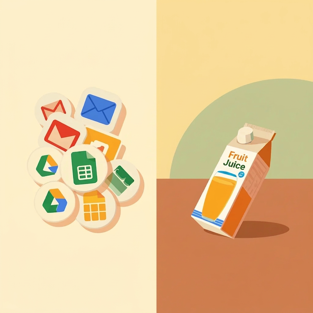
Google’s new Workspace icons: a fresh look for the Gemini era
In May 2026, Google quietly rolled out a redesign of its entire Workspace icon suite, covering Gmail, Drive, Docs, Sheets, Slides, Calendar, Meet, Chat, Keep, Forms, Voice, Tasks, Sites, and Vids. The announcement came without fanfare during Google I/O, slipped into the background of a keynote dominated by AI announcements. But the icons themselves were impossible to miss, and the internet had plenty of opinions.
What actually changed
The most immediately noticeable shift is the move away from Google’s long-standing four-color rule. For years, nearly every Workspace app icon was required to incorporate all four Google brand colors: blue, red, yellow, and green, arranged consistently across the suite. The result was a family of icons that looked cohesive on paper but, in practice, became genuinely hard to tell apart at a glance, especially at smaller sizes on a crowded taskbar or mobile screen.
The new icons break that rule almost entirely. Gmail is the lone holdout, retaining its familiar envelope shape and all four colors. Still, every other app now has a dominant color identity and a soft gradient treatment that echoes the aesthetic already established by the Gemini AI brand. The shapes have also been simplified: Docs, Sheets, Slides, and other document apps no longer sit inside a paper-sheet container, and Calendar, Meet, and Chat have shed their boxy outlines in favor of cleaner, rounder forms. Google described the result as “bold” and framed it explicitly as visual identity work for the “Gemini Era,” a phrase the company is using to signal that AI features are now central to every Workspace product, not an optional add-on.
Why Google made the change
Google’s official explanation, published on the Workspace Updates blog, centers on two things: consistency across the product suite, and individual recognisability for each app. Those two goals might seem to pull in opposite directions, but the thinking behind the redesign is that the old icons achieved surface-level consistency at the cost of distinctiveness. When every icon uses the same four colors in roughly the same proportions, the family reads as a family, but the individual members blur together. The new approach trades the shared color mandate for a shared visual language: gradient, roundness, and simplicity, leaving each app with enough color contrast to stand on its own.
There is also a less explicitly stated motivation that becomes obvious once you look at where Google’s broader visual identity is heading. The gradient treatment running through the new Workspace icons is the same treatment already found in the Google G logo, the Gemini app icon, Google Photos, and Google Maps. The redesign is, among other things, an effort to make Workspace apps feel like full participants in Google’s AI-first product family rather than a separate productivity suite that happens to share a parent company.
How people reacted
The response was, predictably, mixed. On Reddit and across social media, a segment of users pushed back immediately and creatively. Within days of the rollout, memes circulated mocking the new designs, with users posting their own “improved” versions and pointing out that the gradients felt corporate-generic rather than distinctly Google. A common complaint from long-time Workspace users was that apps they had been opening reflexively for years suddenly looked unfamiliar, which is the particular kind of small disruption that feels disproportionately annoying in the middle of a working day.
On the other side, a meaningful portion of users acknowledged that the old icons had long been a genuine usability problem. The criticism that Workspace icons were too similar to distinguish quickly had circulated for years, and several commentators noted that the redesign actually addressed a real pain point rather than changing things for purely cosmetic reasons. Tech Republic and Chrome Unboxed both noted that the updated suite is, in practical terms, easier to navigate, especially on screens where icons appear at smaller sizes.
Android Headlines described the reaction as “divisive,” which feels like the most accurate single word for it. The redesign clearly landed differently depending on how long someone had been using Workspace and how strongly their muscle memory was tied to the old shapes.
My take: color did the heavy lifting
I will be honest: I noticed the new icons the moment they appeared. The shapes were different enough to register as a change, and for a brief moment, I had the mildly disorienting experience of looking at a taskbar that felt slightly rearranged. But the actual effort of identifying each app? Close to zero. I found every icon immediately, without stopping to think, because the color logic held firm. Gmail was still red, Drive was still the multicolored triangle, Calendar was still the blue grid. Google had changed the shapes but kept the color cues that users have been associating with for the better part of a decade, which made the transition almost invisible in functional terms.
That, to me, is what good design evolution looks like. It is not about keeping everything exactly as it was, but about understanding which elements carry the cognitive load for users and protecting those while updating what needs updating. The shape of a Docs icon isn’t what I use to find Docs in a hurry; the blue-and-white color combination is what I reach for. Change the shape all you want, as long as the color anchor stays in place.
When a redesign gets it wrong: the Tropicana lesson
A useful counterexample is Tropicana in 2009, which managed to do almost the opposite. The orange juice brand hired a design agency to modernize its packaging, resulting in a complete overhaul that replaced the iconic image of a straw stuck in an orange with a generic glass of juice. The orange was gone. The distinctive cap, shaped like an orange half, was replaced with a round lid that looked like every other juice on the shelf. The typography changed. The overall structure of the pack changed. In short, almost everything that customers used to identify the product at a glance was replaced simultaneously.
The results were swift and brutal. Sales dropped by around 20% over two months, representing roughly $ 30 million in lost revenue. Customers reported that they could not find their preferred juice on the shelf: the product had become visually anonymous. Tropicana reversed the redesign within weeks, restoring the original packaging and, in the process, providing design schools with a case study that has been taught ever since.
The lesson is not that design should never change, but that users develop genuine cognitive shortcuts around visual identities, and those shortcuts are not trivially overwritten. When a redesign strips away the cues that people actually rely on, the result is confusion and frustration, regardless of how considered the new design looks in isolation. Google, whether by design or good instinct, avoided that trap by keeping the color anchors in place. Tropicana did not, and paid for it immediately.
The broader point about visual identity and trust
Icon redesigns tend to generate outsized reactions relative to their actual functional significance, and there is a reason for that. For tools that people use every day, the visual interface is not just decoration; it is part of the mental model of how the software works. When the look changes, something in that mental model shifts, and even if the shift is small, it requires a moment of recalibration that feels like effort. The more frequently you use a tool, the more noticeable the recalibration is.
What Google has done with this redesign is ask users to update their mental models of the icon shapes while leaving the color associations intact. That is a reasonable ask, and for most users, the adjustment period will probably be measured in days rather than weeks. Whether the gradient aesthetic will look as fresh in five years as it does now is a different question. Still, as transitions go, this one was handled with more consideration for the user experience than Workspace icon changes have sometimes received in the past. For a look at how a brand can push its visual identity in a bold new direction without losing its core recognition, it is worth reading Ferrari Luce: a brilliant case study.
Related sources
- Google Workspace Updates Blog. (2026, May 19). “Introducing a fresh visual identity for Google Workspace app icons.” https://workspaceupdates.googleblog.com/2026/05/introducing-fresh-visual-identity-for-Google-Workspace-app-icons.html
- Li, A. (2026, May 26). “Google on why it redesigned the Gmail and Workspace icons.” 9to5Google. https://9to5google.com/2026/05/26/google-workspace-icons-redesign/
- Android Headlines. (2026, May 26). “Google finally explains its divisive new Workspace icon designs.” https://www.androidheadlines.com/2026/05/google-explains-redesigned-new-workspace-icons.html
- Fast Company. (2026). “Google’s Workspace icons just got the ‘AI gradient’ treatment.” https://www.fastcompany.com/91545582/google-workspace-icons-redesign
- Chrome Unboxed. (2026, May). “Google’s new gradient Workspace icons are officially rolling out on the web.” https://chromeunboxed.com/googles-new-gradient-workspace-icons-are-officially-rolling-out-on-the-web/
- AIN Ukraine. (2026, May 28). “New Google Workspace icons sparked memes.” https://en.ain.ua/2026/05/28/google-updated-workspace-icons-users-turned-the-redesign-into-memes/
- The Branding Journal. (2015). “What to learn from Tropicana’s packaging redesign failure.” https://www.thebrandingjournal.com/2015/05/what-to-learn-from-tropicanas-packaging-redesign-failure/
- Young Marketing Consulting. (n.d.). “When rebrands go wrong: lessons from Gap, Tropicana, and Cracker Barrel.” https://www.youngmarketingconsulting.com/when-rebrands-go-wrong-lessons-from-gap-tropicana-and-cracker-barrel/
