
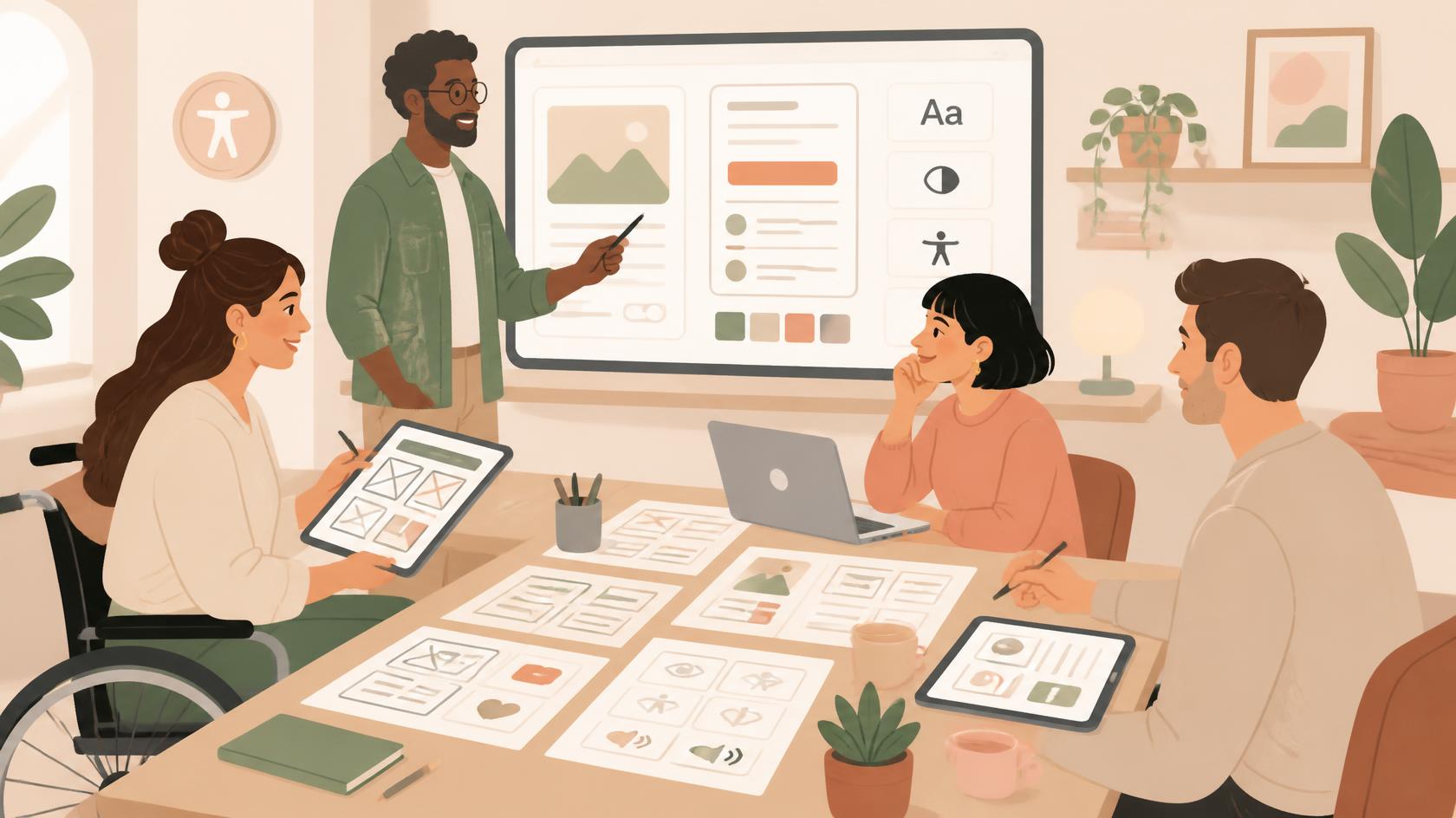
There’s a quiet shift happening inside design teams, the kind that’s easy to miss because it doesn’t show up right away. According to Material Design’s State of Design survey, nearly half of the teams working on a design system say they’ve already built accessibility guidelines into it, not as a footnote but as part of the system itself. The figure comes from a specific context, design systems, but it points to a wider trend: accessibility is no longer the last check before release, but a requirement discussed from the first wireframe onward, alongside layout, visual hierarchy and content.
Years ago I joined PayPal’s accessibility ambassador programme, an internal initiative that trained people across different teams (design, content, engineering) to bring accessibility expertise into their own projects, instead of leaving it as the sole job of one specialised department. That experience is what made clear to me how differently the two paths play out, building accessibility in from the start versus fixing it at the end, both for the people using a product and for the people building it.
What changes when accessibility joins the process from the first wireframe
In software development jargon, this is often called “shift left”: moving a quality check as early as possible in the workflow, instead of discovering it late, when it costs more to fix. Applied to design, it means moving from a model where accessibility gets checked, and often patched, right before launch, to one where colour contrast, semantic structure, focus states and alt text are decided together with the rest of the interface.
The practical difference is significant. A button missing an accessible label, caught during QA, needs an isolated fix, often urgent and disconnected from the context it came from. The same button, designed as an accessible component inside the design system, automatically carries its label, its focus state, its correct contrast, wherever it gets reused. It isn’t a technical detail: it’s the reason the most mature design systems, as Figma’s own blog explains, aim to build components that are “accessible by default”, meaning compliant with standards from the moment they’re created, so every product built with those building blocks inherits conformance instead of having to chase it.
What “accessible by default” actually means in practice
It isn’t a certification, nor a box to tick once and forget. It’s a set of habits that become part of the everyday flow of anyone designing an interface:
- thinking about content hierarchy through correct semantic markup, not just a visual style that “looks like” a heading;
- checking contrast between text and background while choosing a palette, not after it’s already been approved;
- designing visible focus states for keyboard navigation, not just interactions built for mouse or touch;
- writing alt text and field labels as part of the content itself, not as metadata bolted on later;
- involving people with disabilities in user research, instead of relying only on technical checklists filled out from a distance.
That last point, in my experience, is what makes the real difference. A WCAG checklist tells you whether a component meets certain technical criteria; a session with someone who uses a screen reader every day shows where that component actually creates friction. These are two different layers of verification, and both matter.
The six problems that keep showing up on homepages everywhere
The WebAIM Million report, which analyses the accessibility of the million most visited homepages every year, offers a useful gauge of how far there still is to go. In the 2026 edition, 95.9% of the homepages analysed had at least one detectable WCAG failure, with an average of 56.1 errors per page, a 10.1% increase over the previous year. Six categories of issues, the same ones year after year, account for 96% of all errors found: low contrast text (83.9% of pages), missing image alt text (53.1%), unlabelled form fields (51%), empty links (46.3%), empty buttons (30.6%) and undeclared page language (13.5%).
Nearly all of these are avoidable at the design stage, before development even begins. An empty link or a button with no text, for instance, often comes from an icon used without an accessible label, a choice made at the design table, not caught during final testing. The same tension runs through icons and legibility whenever a symbol has to carry meaning on its own.
The cost of putting it off until the end
Level Access’s State of Digital Accessibility report flags an interesting paradox: even though it’s now clear to anyone working in the field that addressing accessibility early is the most efficient way to handle it, proactive adoption is slowing compared to previous years. The reason is nearly always the same, summed up well by someone working in fintech: fixing accessibility after a product has already been built requires costly rework, often more expensive than getting the design right the first time.
The same principle applies to plenty of other aspects of digital product quality, from error microcopy to call-to-action buttons: the later a fix comes, the more it costs and the harder it is to get right.
My time as an accessibility ambassador at PayPal
When I joined the internal accessibility ambassador programme, the first thing I learned was how little I actually knew, despite years spent working on interfaces and content. I’d assumed that “writing well” for a label or an error message was enough to make it useful to anyone. The training sessions, and especially the direct conversations with people using assistive technology, showed me how many small everyday choices, tab order, how long a message read aloud by a screen reader takes, the way an error gets announced inside a form, could completely change the experience of someone simply trying to finish a sign-up or a payment.
I’ve written elsewhere about the details of one of those projects, the one about the sign-up button in Italy, and it’s still the example I reach for most often when someone asks why accessibility should enter the design process from day one: not because it’s a legal requirement (even though it often is), but because the cost of ignoring it always falls on whoever has the least room to work around the obstacle.
Where Italy’s public administration still falls short
If there’s one area where the gap between theory and practice stays wide, in Italy, it’s exactly the public sector. Just try navigating the website of INPS, the Italian social security agency, or the Revenue Agency, to see how much work is still needed: unintuitive navigation paths, forms that are complicated to fill out even for people without any disability, content written in technical language that seems designed to discourage readers rather than guide them.
I saw this first-hand as a volunteer for the DiParola Festival, in its 2024 edition dedicated to precision in language. I contributed to the research for the Observatory on Clear Language, run by the Associazione Linguaggi Chiari, evaluating four institutional websites out of twenty analysed overall. The work combined automated text analysis, using READ-IT, a tool developed by the CNR’s ItaliaNLP Lab, with a review based on the principles of the ISO 24495-1:2023 standard on clear language. Even there, the main problem wasn’t a shortage of guidelines, which exist and are fairly detailed, but the point at which they get applied: almost always after the fact, rarely during the design of content and interfaces.
A practical checklist for getting started
For anyone designing interfaces who wants to move accessibility further upstream in their workflow, a few concrete starting points:
- add a colour contrast check to the design tools already in use, through plugins or extensions, instead of only verifying it once development is done;
- document focus states, reading order and alt text directly in design files, as part of the specs handed over to development;
- build (or adopt) design system components that are already compliant, so every new screen inherits accessible properties automatically;
- include people with disabilities in usability testing whenever possible, not only during final validation;
- treat every exception to accessibility guidelines the way you’d treat an exception to any other product requirement: documented, justified, and with a plan to resolve it.
None of this requires reinventing the design process from scratch. What it takes, instead, is treating accessibility as a component of the product on equal footing with the others, carrying the same weight given to performance, security or visual consistency. It’s more a cultural shift than a technical one, and like most cultural shifts it moves in waves: first the teams most exposed to the issue (fintech, public administration, large platforms), then, gradually, everyone else.
Related sources
- WebAIM: The WebAIM Million – The 2026 report on the accessibility of the top 1,000,000 home pages
- The Future of Design Systems Is Accessible – Figma Blog
- Applause Global Accessibility Survey: Prioritize Inclusive Design
- State of Digital Accessibility Report 2025-2026 – Level Access
- Shift Left Accessibility: What It Is and How to Implement It – BrowserStack
- Start with Accessibility: How to Integrate It into Web Projects – W3C WAI
- Osservatorio sul Linguaggio Chiaro – Festival DiParola
- Festival DiParola 2024: la chiarezza ha bisogno di parole precise – Treccani
